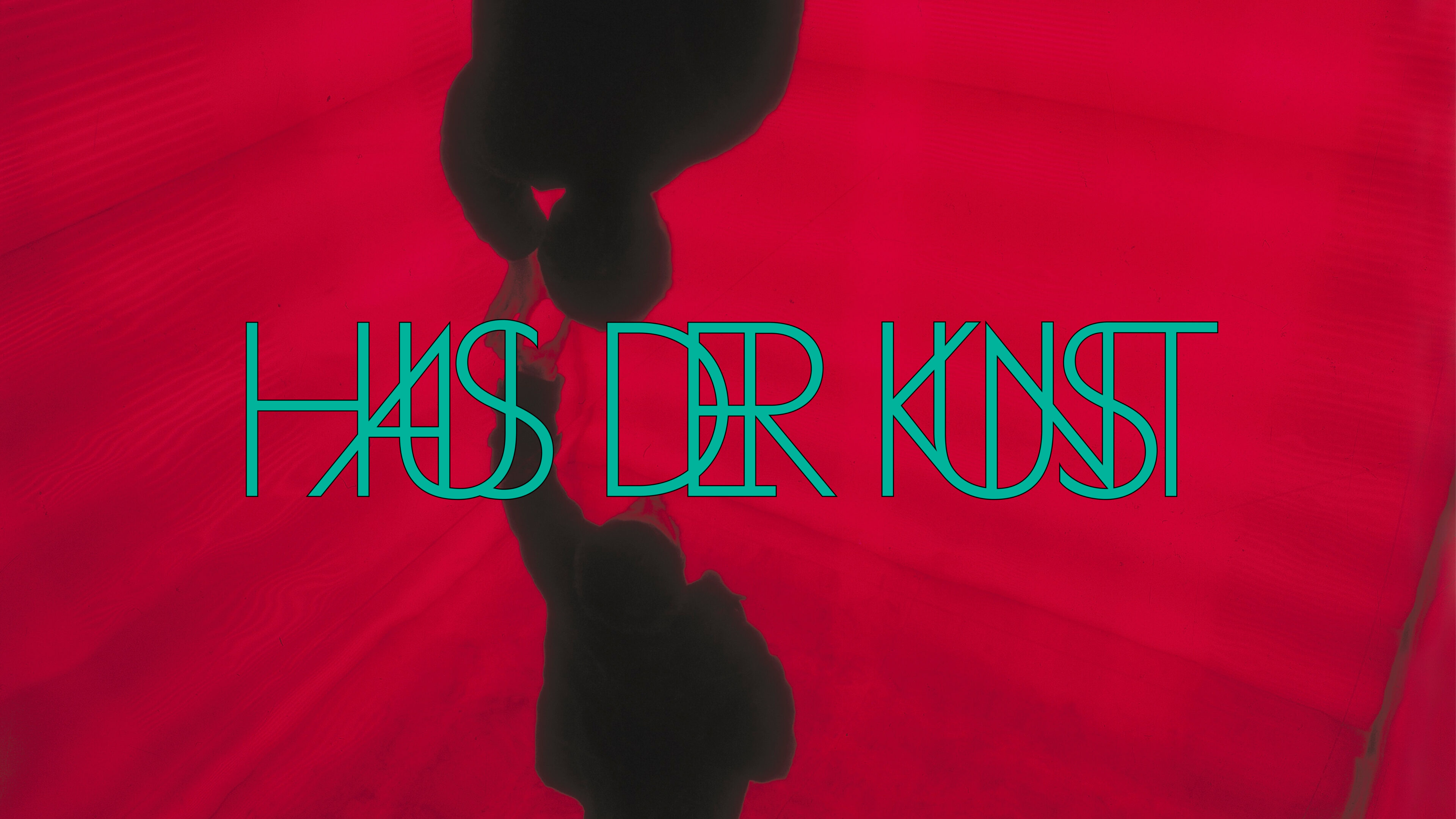
Haus der Kunst has developed a new visual identity which highlights the intention of its intertwined programme, and sits in dialogue with the site of Haus der Kunst itself — its form, colours, and tones.
In a new visual approach, exhibition titles and artists’ names become interlaced, echoing how Haus der Kunst brings together and intertwines audiences, artists and disciplines.
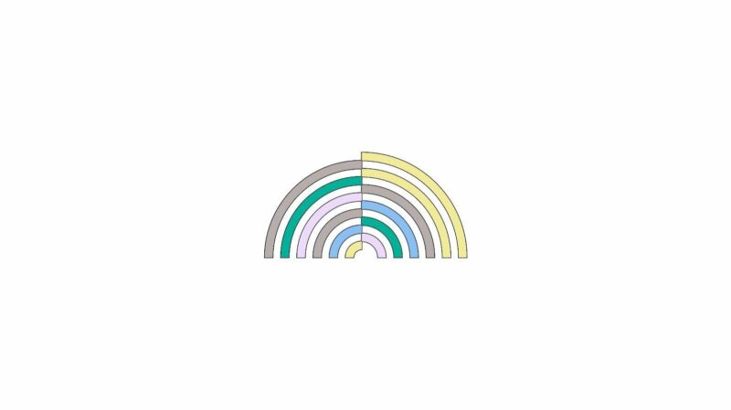
The new logo is based on the columns of the building twisting and bending. The icon represents the idea of togetherness and encounter that is crucial for the Haus der Kunst programme. It is not by chance that it resembles a forum as a site of gathering, a broadcast transmitting waves, a rainbow, an emblem of peace and diversity, and a bridge between people and places.
The music and sound programme TUNE has its own striking visual identity based on a process of algorithmic transformation that translates a sentence into sound and eventually back into visual language, hence embodying the multiple and intensively discursive layers of TUNE.
Both designs have been developed in close collaboration by Haus der Kunst and Bureau Borsche.
Click here for information on upcoming exhibitions. Find out more about the programme and stay up to date by subscribing to the newsletter.