At the beginning of his 60-year artistic career, the artist Franz Erhard Walther intensively explored type, typeface and font design. In the following tutorial to be completed at home, you will discover the importance of font and color and why your full imagination is required to understand the word paintings in the subsequent workshop tutorial to complete at home.
While studying commercial graphics at the Offenbach Werkkunstschule, Franz Erhard Walther worked on the design of type and typefaces. He considered the relationship between concept and language and how it could be expressed in form and color for artistic expression. When, in his later large-scale fabric works, a physical action in relation to a work was necessary, the principle of the action continued to occur solely in the mind of the beholder.
By the way ...
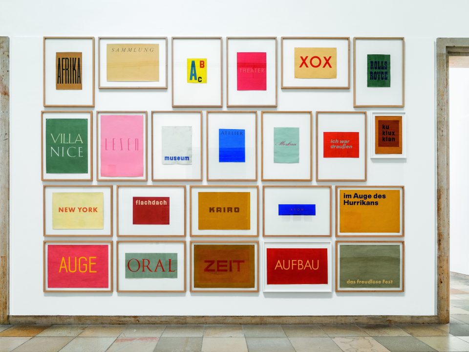
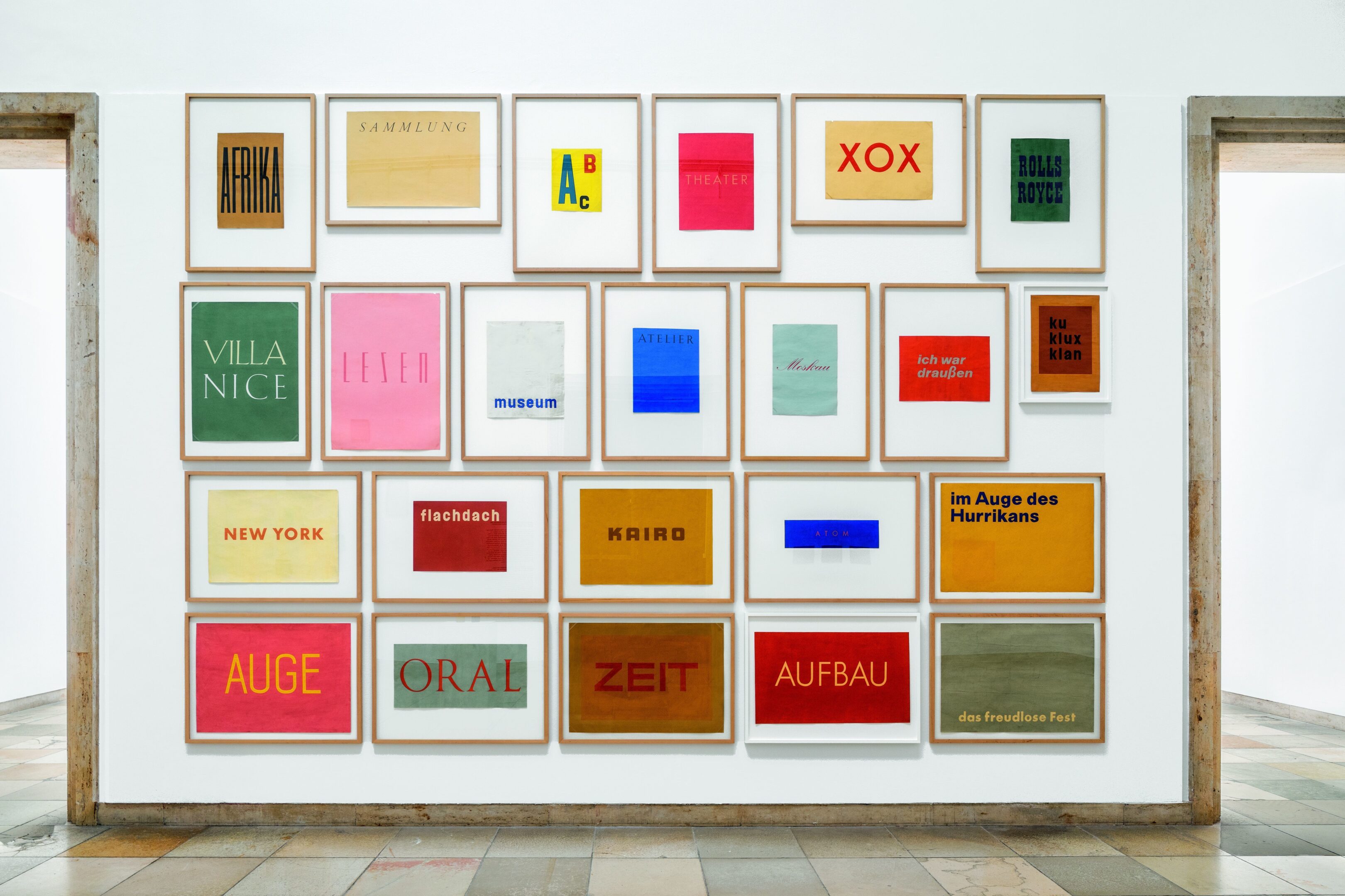
Much later in his artistic career, Franz Erhard Walther designed individual letters as enormous wall and floor sculptures made of fabric. You can discover these in the exhibition. We look forward to seeing you there!

Using the example of two different word paintings by the artist, we would like to briefly explain how Walther creates content using form and color and how a simple word can stimulate your mind and inspire your imagination.
In this word painting, the artist placed the word ‘Afrika,’ written in black letters, against a brown ochre paper ground. The letters are narrow and elongated. Was Walther thinking about giraffes and their long necks and legs or perhaps very tall and slender palm trees?
The choice of the background color is also significant. Walther selected a brown ochre, a warm, earthy tone, which he may have associated with the Sahara, the African desert.
From a single word, you may be able to visualize an image of many puzzle pieces if you use your knowledge and imagination.
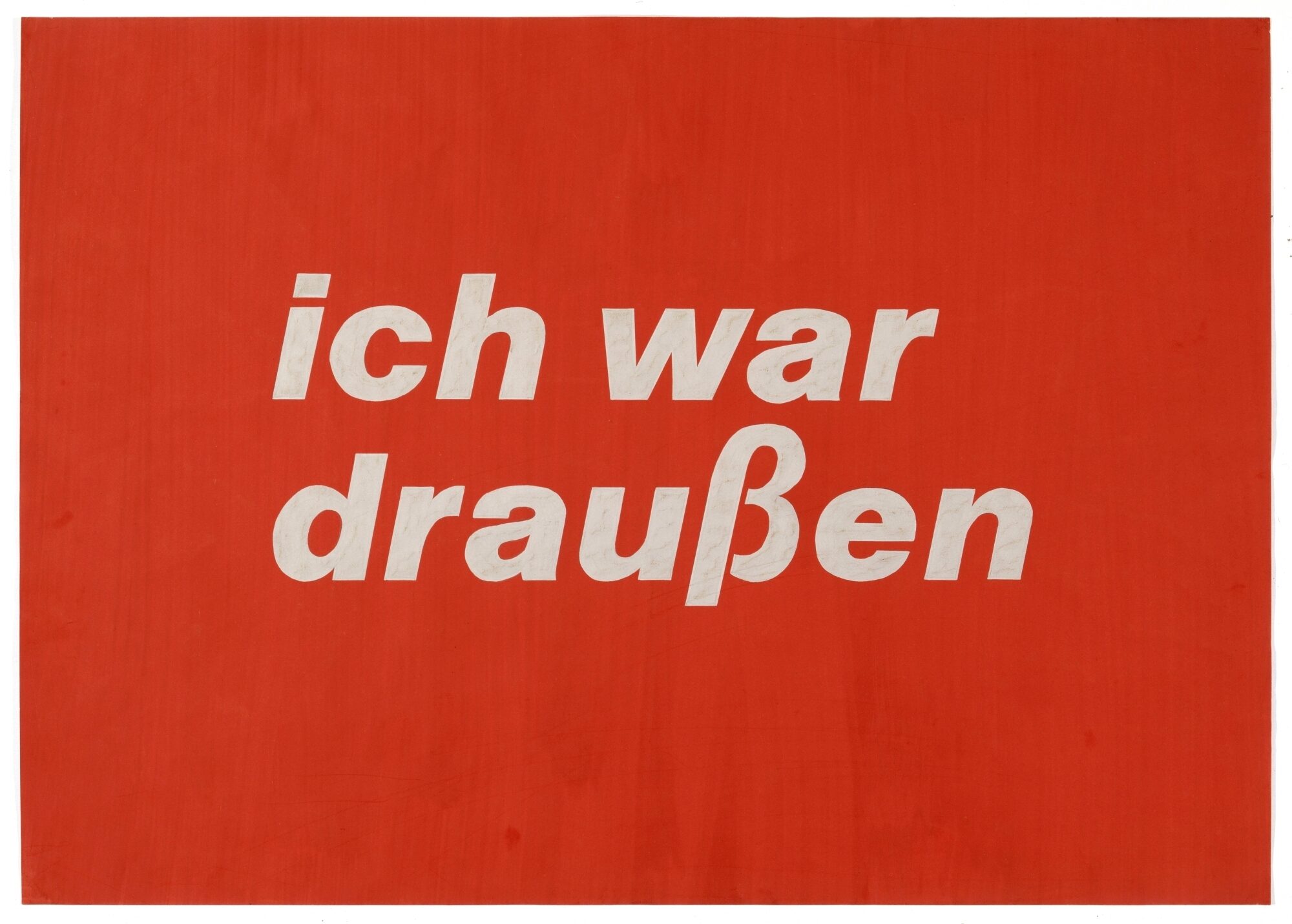
Let’s look at Walther’s second word painting:
In this word painting, Walther designed the word 'Zeit' (Time) in a broad, calm type. He chose a pink for its color. The word appears against a two-tone background. Set against the olive-brown background, the artist placed a smaller, light brown rectangle, in which the word 'Zeit' is located.
Think about what might have prompted the artist to use the typeface and colors.
Perhaps he was thinking of a specific, intense and joyful event, which he chose to express with the color pink. The artist depicts time as a sequence of movements and changes through the two layers of superimposed paint. The darker brown color also shimmers through in the layer of lighter brown paint. Time is flowing. Does the artist refer here to a certain time of day or an event in a particular place?
Now it is your turn to embark on a magical word journey and design your own word painting!
In the following video tutorial, our art teacher Rose Stach demonstrates how to design a word painting in a few simple steps. Rose has chosen the word 'flamingo' to illustrate the best way to design such a word painting.
Before you begin, you should gather a few things together that you will need to create your word painting:
- magazines, to help you learn about different types and fonts
- graph paper, colored construction paper (if you do not have construction paper, you can also paint a sheet of thick white paper or cardboard using a color that corresponds to your idea)
- a pencil, watercolors or crayons, a paint brush
- scissors, a ruler, an eraser, a pencil sharpener
- paper tape
- a glass of water
Let’s begin!
Now it is your turn! Show us your work and share it on social media at #hausderkunst and #atelierHDK or send it to us by email at atelier@hausderkunst.de
Sylvia Clasen is in charge of the studio at Haus der Kunst.